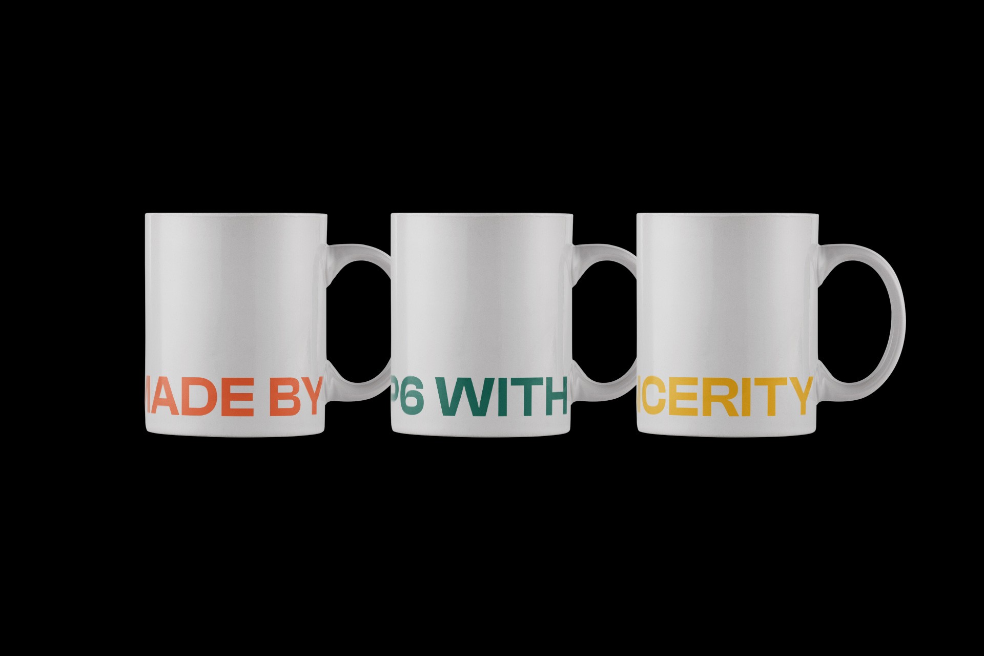
Handmade products are made by hands, so they are rough, but with more effort, they become more sophisticated. It is similar to analog, but it uses an angled form of digital pixels to express sophistication. Various graphic types composed of pixels express spatial characteristic of containers and the artistry / creativity of makers, and show the extendability to a wider area without being limited to handmade. Logo implicitly expresses three characteristics: handmade, container, and rail bottom ground.
Handmade products are made by hands, so they are rough, but with more effort, they become more sophisticated. It is similar to analog, but it uses an angled form of digital pixels to express sophistication. Various graphic types composed of pixels express spatial characteristic of containers and the artistry / creativity of makers, and show the extendability to a wider area without being limited to handmade. Logo implicitly expresses three characteristics: handmade, container, and rail bottom ground.
Handmade products are made by hands, so they are rough, but with more effort, they become more sophisticated. It is similar to analog, but it uses an angled form of digital pixels to express sophistication. Various graphic types composed of pixels express spatial characteristic of containers and the artistry / creativity of makers, and show the extendability to a wider area without being limited to handmade. Logo implicitly expresses three characteristics: handmade, container, and rail bottom ground.
핸드메이드 제품은 손으로 만들어 투박하지만 그만큼 더 많은 정성과 노력을 통해 더 정교해집니다. 아날로그에 가까운 핸드메이드지만, 정교함을 표현하기 위해 디지털 픽셀의 각진 형태를 빌려왔습니다. 픽셀로 이루어진 다양한 형태의 그래픽은 컨테이너가 쌓인 공간적 특징과 메이커들의 예술성 및 창의성을 표현하며, 핸드메이드에 국한되지않고 더 넓은 영역까지의 확장 가능성을 보여줍니다. P6의 로고는 핸드메이드와 컨테이너, 그리고 철도 하부 부지 세 가지 특성을 함축적으로 표현합니다.
핸드메이드 제품은 손으로 만들어 투박하지만 그만큼 더 많은 정성과 노력을 통해 더 정교해집니다. 아날로그에 가까운 핸드메이드지만, 정교함을 표현하기 위해 디지털 픽셀의 각진 형태를 빌려왔습니다. 픽셀로 이루어진 다양한 형태의 그래픽은 컨테이너가 쌓인 공간적 특징과 메이커들의 예술성 및 창의성을 표현하며, 핸드메이드에 국한되지않고 더 넓은 영역까지의 확장 가능성을 보여줍니다. P6의 로고는 핸드메이드와 컨테이너, 그리고 철도 하부 부지 세 가지 특성을 함축적으로 표현합니다.
핸드메이드 제품은 손으로 만들어 투박하지만 그만큼 더 많은 정성과 노력을 통해 더 정교해집니다. 아날로그에 가까운 핸드메이드지만, 정교함을 표현하기 위해 디지털 픽셀의 각진 형태를 빌려왔습니다. 픽셀로 이루어진 다양한 형태의 그래픽은 컨테이너가 쌓인 공간적 특징과 메이커들의 예술성 및 창의성을 표현하며, 핸드메이드에 국한되지않고 더 넓은 영역까지의 확장 가능성을 보여줍니다. P6의 로고는 핸드메이드와 컨테이너, 그리고 철도 하부 부지 세 가지 특성을 함축적으로 표현합니다.